 |
| The New Zealand ensign. Although this image is what is currently provided by the responsible ministry, the flag colours are, more correctly, red (Pantone 186C, websafe RGB 204-0-0), blue (Pantone 280C, websafe RGB 0-0-102) and white. Manatū Taonga/Ministry for Culture and Heritage |
Changing brands is a conventional corporate strategy. The thinking goes that if a corporate image – as conveyed by a company logo, house style or a name – is somehow or another tainted by scandal, or even if it's just perceived as old fashioned, then a complete makeover is a certain way of ensuring that the smear of dodgy business or the blemish of decrepitude won't endanger profits and that shareholders and managers can carry on reaping the benefits of the business. Banks, for example, regularly seek to detoxify their image by transmogrifying their logos, house styles and names, so it should come as no surprise that as a former bank employee, Mr Key – probably the first prime minister of New Zealand to conceive of his position in primarily corporate terms – should seek to 'update' the country's corporate image. For Key, as the CEO of New Zealand Ltd, changing the flag is merely a branding exercise, a bit of flag waving, which he'll pass by the chairman (the governor general), the board (cabinet) and submit to a general meeting of the shareholders (the electorate) for confirmation.
 |
| Flag of the Vereenigde Oost-Indische Compagnie (Dutch East India Company). Himasaram, Wikimedia |
Flags should not be understood simply as ephemeral brands or tokens of national identity, but rather as visual symbols that people use to communicate with themselves and others. They are portable, material, objects that allow identified groups to recognise, embrace and defy others; they mark out particular individuals; they define and assert allegiances and commitments. They're used for religious, political, military and peaceable purposes. Some flags convey a sort of visual whakapapa, a genealogy if you like, a sort of history, emblazoned with emblems and signs vested with specific significance or meaning. They have become emotional rallying points in the way that they have come to define nations, cultural and religious adherences and patriotic allegiances. Indeed, these pieces of coloured cloth, marked out with signs and symbols, even when faded and tattered, are more than just brands requiring an update, every now and then, in order to conduct business as usual.
A short genealogy of flags in New Zealand
 |
| [Isaac Gilsemans], De Moordenaars Baay vertoont zich aldus, als gy daer in op 15 vadem ten anker legt. (A view of the Murderers' Bay when you are anchored there at fifteen fathoms), [1642]. Alexander Turnbull Library (PUBL-0086-021) |
 |
| British red ensign (1707-1801). Wangi, Wikimedia |
A number of flag designs emerged during the 1830s, as it became increasingly evident that the islands forming what Europeans described as New Zealand required a flag to identify the increasing number of ships owned by their inhabitants. Kerryn Pollock in her essay on flags in Te Ara suggests that the first was devised in 1831 by Thomas McDonnell, a retired Royal Navy officer and captain of the Sir George Murray barque, in response to a requirement by British colonial authorities that all ships entering Port Jackson display a recognised national flag.
 |
| 'Domestic intelligence', Sydney Herald (22 August 1831), p. 4 |
 |
| Sydney Gazette and New South Wales Advertiser (07 May 1833), p. 2 |
In an attempt to resolve this and other issues relating to British interests in New Zealand and acting on the instructions of the Colonial Office in London, Richard Bourke, governor of New South Wales, appointed a British representative, James Busby, whom he despatched to Waitangi in May 1833. Among Busby's tasks was a resolution of the flag issue. The British proposed three possible designs developed by the Admiralty (the agency of state controlling flags) in collaboration with the College of Arms (the branch of the royal household responsible for heraldic matters) in London. They included a striking flag reminiscent of not only the British East India Company and the revolutionary American Grand Union flags but also, more romantically, that of the Kingdom of Hawai'i and of newly independent Greece (adopted in 1822); it comprised four horizontal white bars on a blue field with a union jack in the canton.
In 1835 Busby submitted the three proposals to a selection of North Island rangatira who following a brief consultation selected the flag promoted by members of the Church Missionary Society (CMS), since 1814 the dominant Pākehā presence in the country <W Yate, An account of New Zealand and the formation and progress of the Church Missionary Society's mission in the northern island (London: Seeley and Burnside, 1835), p. 29>. The rapid process of choosing the flag was recorded by the CMS carpenter and catechist Henry Miles Pilley:
Busby's effort in resolving the flag issue was conveyed to the Colonial Office and in August 1835, having passed the final imprimatur of the Admiralty, the agreed ensign was officially gazetted making it possible for New Zealand ships to trade with British possessions, including not only Australia but also India. By flagging its own ships New Zealand made the first move into being a trading country, rather than one that just loaded its raw materials onto foreign vessels for others to process and sell. Adopting a flag asserted a level of economic as well as political independence but the process of 'selection' also confirmed New Zealand's entanglement in the amorphous web of the expanding British empire.
 |
| One of three British proposals for a New Zealand ensign (1835). António Martins, Flags of the World |
We had a grand day on Thursday, March 13. A man-of-war ship came in, bringing three flags with her, for the chiefs to decide by vote which should be the standard of the nation, as New Zealand was about to be placed on the scale of nations. Mr Bushy (sic), the British resident, provided a splendid dinner for the Europeans, which were from fifty to sixty in number, chiefly consisting of the captains and other officers of the man-of-war, captains of merchant ships, the missionaries and respectable settlers; the natives were also provided with plenty of boiled flour, which they esteem the greatest luxury. When the flag was hoisted, twenty-one guns from the man-of-war were fired, the natives joining in one continual shout of acclamations. The day was an important one.<H Pilley, The New Zealand missionary (Cheltenham: William Wight, 1838), p. 27>.The selected flag comprised the St George's cross of England with the arms of the soon-to-be-established Anglican diocese of Australia in the canton. The ensign is known today as He Whataputanga or the flag of the United Tribes of New Zealand. While the missionaries were undoubtedly delighted by the choice of a flag invested with Anglican symbolism, the rangatira were more probably persuaded by the CMS-promoted flag having a higher proportion of red than the other two options. Moreover it wasn't so brazenly deferential to Britain. The decision on the flag foreshadowed the declaration of the independence of New Zealand made by a loose confederation of the same rangatira some months later.
 |
| The standard of New Zealand from William Yate, An account of New Zealand and the formation and progress of the Church Missionary Society's mission in the northern island (London: Seeley and Burnside, 1835), p. 22. The flag of the United Tribes of New Zealand was perceived by the society's local representatives as a clear expression of Māori embrace of Christian symbolism. University of California |
***
In February 1840, following the signing of the Treaty of Waitangi between Māori and a representative of the British crown, the flag of the United Tribes of New Zealand was supplanted by the various flags of the United Kingdom, primarily the British civil ensign, the union jack. Throughout the British empire flags were not only important symbols of power but also had significant functional purposes. The harbours in both Sydney and Auckland, amongst other colonial outposts, were marked by a series of manned flagstaffs which not only identified British hegemony but in the absence of alternative and reliable lines of communication also provided their administrators with a primitive form of radar. News of an arriving vessel up to around 50kms away could be signalled to colonial authorities in a matter of minutes, allowing them to not only determine the intent of the arriving vessel but also to enable their response. Until 1876, when New Zealand was connected by telegraph cable to the rest of the world, flags not only announced the arrival of orders, information and migrants but also, in the form of the union jack, reinforced a sense of British hegemony over the country and its sea lanes.  |
| After P Walsh The old Colours of the 58th Regiment, at present hanging in the Supreme Court, Auckland. The 58th (Rutlandshire) Regiment of Foot was sent to New Zealand in 1845 and remained there until 1858. The regimental colours were presented to the people of New Zealand in 1860. Reproduced in Auckland Weekly News (28 December 1900). Sir George Grey Special Collections, Auckland Libraries (AWNS-19001228-6-4) |
In a subtly different way, flags – ngā haki or ngā kara – became rallying points for Māori as they were progressively stripped of their lands by an expanding inflow of Pākehā settlers. Between 1844 and 1845, Hōne Heke, a Ngāpuhi rangatira, ordered the cutting down of the British flagpole at Kororāreka four times; the final felling saw British troops involved in fighting with and against various northern iwi. Flags were key elements on both sides of the Great New Zealand War as North Island Māori sought to protect their land from the predatory grasp of Pākehā capitalism between 1860 and 1872.
By the time of the Second World War the silver fern had acquired significant military associations, being used in the design of military cap badges, ship's badges of the newly formed Royal New Zealand Navy and a range of other naval, military and police applications. Its medallic apotheosis came with the New Zealand War Service Medal, designed by the academic John Cawte Beaglehole and the artist Mervyn Taylor in 1947. Beaglehole recounted that the Labour 'Cabinet says it doesn't like the Army's idea, what Cabinet wants is a fern-leaf like on the All Black's jersey, & Peter [Fraser, the prime minister] asks me to arrange it accordingly.' <Letter from J C Beaglehole to Janet Paul, 10 July 1947, cited in T Beaglehole, A life of J C Beaglehole (Wellington: VUP, 2006), p. 300>.
 |
| P Reveirs, [Māori rebel flag] No. 5, [c. 1865]. A watercolour rendering of the flag of Te Kooti Arikirangi Te Turuki (c 1832-93), a Māori rebel leader and prophet from Ngati Maru, a hapu (subtribe) of the Rongowhakaata (tribal group). Judith Binney asserts the crescent symbolised a new beginning; the cross stood for the fighting Archangel Gabriel; and 'Wi' was a recurring holy day. Museum of New Zealand Te Papa Tongarewa (1992-0035-1631-12A) |
Whereas Pākehā flags deployed in the conflict were coded by tradition to conform with military and civil regulations, Māori approached the design of flags in a way that was both innovative and creative, drawing upon an appropriated lexicon of re-interpreted symbols and words to develop a new vexillogical vocabulary. But it was the rigid rules of the British Admiralty that devised the flag that for the twentieth century was used by New Zealanders to mark their land and identify themselves.
 |
| Modern rendering of the flag deployed by Tauranga Māori fighting British troops at Pukehinahina (Gate Pā) in 1864. The flag was deployed strategically in the battle to mislead attacking British troops. Tauranga City Libraries |
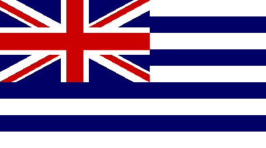
New Zealand's modest blue ensign devolved from the British blue ensign. Until 1864, when the Royal Navy was reorganised, the blue ensign was the flag of its Blue Squadron. Following reform, it was allocated to those ships either in government service or commanded by a reservist officer. In 1865 a regulation was promulgated requiring ships under the control of colonial governments to fly a blue ensign defaced by the badge or coat of arms of the appropriate colony. As the colony had no badge, let alone a coat of arms, the governor, George Gray, ordered that the flag be defaced with the letters NZ in red fimbriated in white. Merchant vessels registered in New Zealand were to fly a red ensign, defaced with the letters NZ in white. Lettering on flags was a relatively recent phenomenon that in the mid-nineteenth century was still associated in British official thinking with the American revolution. The lettered badge defacing the blue ensign was replaced in 1869 by four red five-pointed stars – representing the Southern Cross constellation – on either a white ground, or with the stars fimbriated in white, on a blue ground. While the union jack remained the national flag, the locally inflected blue ensign became used increasingly to identify New Zealand as a distinct political identity. Notwithstanding Admiralty objections, this situation became regularised in 1902 when the monarch approved the New Zealand Ensign Act, 1901 which established the defaced blue ensign as a distinctive flag for New Zealand. While not an inspired example of design, it's now the fifteenth oldest national ensign currently flying in the world.
 |
| F J Grant, Māori reception during the tour of the Prince of Wales, Arawa Park, Rotorua (1920). Alexander Turnbull Library (PA Coll-7081-03) |
The blue ensign, the symbol of the settlers, did not find much popularity amongst Māori who, if accepting of Pākehā hegemony, flew a red ensign defaced with their iwi name. Others, over the course of the twentieth century, either continued to fly the flag of the United Tribes of New Zealand or developed their own flags, drawing upon a variety of symbols and meanings. The Kīngitanga, for example, used a variety of flags and very early on regularised their use, effectively developing a tradition of reign flags. The current king Tuheitia's flag, which bears Te Paki o Matariki, the coat of arms of the Kīngitanga, was first raised in 2009. Other Māori independence movements, such as Kotahitanga, also deployed flags as 'symbols of mana and to show allegiances'. It was not until 1990 that a single flag representing Māori was proposed. It followed from two decades of activism as Māori sought to reclaim that which they had been denuded of by Pākehā.
 |
| Hiraina Marsden, Jan Smith and Linda Munn, Tino Rangatiratanga flag (1990). James Dignan and António Martins, Flags of the World |
Designed by Hiraina Marsden, Jan Smith and Linda Munn, the Tino Rangatiratanga flag – the name translates loosely as 'absolute sovereignty' – was the winner of a nationwide competition to find a flag that represents all Māori. Although it employs traditional colours and references traditional symbolism, the flag's design – based on a magnification of traditional kowhaiwhai (rafter decoration) – is very much of its time. As a consequence of coalition negotiations between the National party and the Māori party, the flag was accorded official status as the national Māori flag in December 2009.
Changing the flag
Key's proposed referendum on changing the New Zealand flag is a step toward realising an ambition long held by a number of New Zealanders to replace the current blue ensign with a flag that symbolises how they feel about their country. There have been numerous proposals over the years. Most of these have tended to be vexillogical nightmares: bizarre conflations of colours, overly literal symbols, visionary chimeras and, somewhat embarrassingly, a new phase of Pākehā appropriation of Māori iconography, albeit at a remove. Announcing his decision to hold a referendum, Key indicated that his flag of preference was a white 'silver fern' leaf on a black field, not coincidentally, an image most commonly associated with the All Blacks, the New Zealand national rugby football union team.
 |
| Dave Clark, Silver fern design for the New Zealand Rugby Football Union (1991). One of many proposal for a black flag defaced with silver fern frond. Some versions place the words 'New Zealand' underneath the frond. Wikimedia |
The first official use of the fern as a symbol of New Zealand seems to have occurred in 1869 when the British War Office issued a campaign medal to British and colonial servicemen and Kūpapa involved in fighting those Māori resisting settler incursion in Taranaki and Waikato during the New Zealand Land Wars of 1860-1866. The fern pattern did not appear on the medal itself – the reserve was designed with a conventional victory laurel wreath – but on the arms of the ribbon suspender. Under the circumstances it might be considered somewhat ironic that a fern – the first symbol used to identify the country by its colonising power – has been appropriated by those ostensibly seeking to remove the symbols of the country's 'colonial and post-colonial era'.
 |
| Unidentified designer for the British War Office, New Zealand medal (1869). New Zealand Defence Force Te Ope Kātua o Aotearoa |
The silver fern first entered the New Zealand state's iconography when it was paired with an oak branch to form a wreath on the obverse of the New Zealand Long and Efficient Service Medal which was first issued in 1887 to veterans with sixteen years service in the New Zealand Militia. The medal was probably designed by its first manufacturer, the Prussian-born Wellington-based goldsmith and jeweller Siegfried Kohn. Kohn had earlier designed the medal awarded at the New Zealand Industrial Exhibition (Wellington, 1885) which also depicted fern fronds, albeit those of the button fern, rather than the silver fern (Pellaea rotundifolia in preference to Cyathea dealbata).
 |
| Siegfried Kohn (1854-19?), New Zealand Industrial Exhibition silver medal (1885). National Museum of New Zealand/Te Papa Tongarewa, bequest of Mrs Mary H Quin, 1956 (PC000254) |
A later military medal, the New Zealand Volunteer Service Medal of 1902 depicted a full wreath of silver fern fronds on its reverse. The military application of these depictions suggest not only that the fern wreath was seen as a local inflection of the laurel wreath given to the victorious in antiquity, but it also ties in with the nascent nationalism evident in the colony from the 1880s.
 |
| Siegfried Kohn (1854-19?), New Zealand Long and Efficient Service Medal (1887). National Museum of New Zealand Te Papa Tongarewa, gift of Mr Dollimore, 1956 (NU006152) |
 |
| John Cawte Beaglehole (1901-1971) and Mervyn Taylor (1906-1964), Reverse of the New Zealand War Service Medal, [1947]. New Zealand Defence Force Te Ope Kātua o Aotearoa |
The national rugby football union team, the All Blacks, adopted the silver fern frond on a black ground logo in 1893, six years after its appearance on the Long and Efficient Service Medal. While rugby union football might well be regarded as 'the national game' by its supporters, it is, like the military, an activity that's largely the preserve of young males, with an emphasis on disciplined physicality. Unsurprisingly, the military's symbols leached, probably quite subliminally, into those of sporting teams, and vice versa.
 |
| E Kelley, All Black rugby team that toured the United Kingdom in 1905-6. Making New Zealand: negatives and prints from the Making New Zealand Centennial collection. Alexander Turnbull Library (MNZ-1035-1/4F) |
Both the New Zealand military and the New Zealand Rugby Football Union (NZRFU) are fundamentally conservative organisations and the innocuous, if somewhat laudatory, quality of the fern leaf emblem, one untarnished by history and devoid of any significant pre-association, would have appealed to the mindset of those responsible for choosing its differentiating emblems. In recent years, as the game of rugby has lost its amateur status, the All Black livery has been turned by the NZRFU (now known as Rugby New Zealand) into a legally-protected corporate logo. However, although a version of the silver fern was trademarked in 1991, the increasingly corporatised NZRFU's attempts to control the image have foundered in litigation with the assistant commissioner of trademarks ruling in 2008 that the silver fern was 'very broad in scope and had a low level of inherent distinctiveness'.
 |
| Crispin Schuberth, New Zealand Labour party logo (2011) |
Although its most prominent incorporation into the regalia of state came about through the wishes of a Labour party cabinet and that it has intermittently formed a part of the New Zealand Labour party logo, the silver fern has, since the 1970s, been favoured by National party and corporate interests as a suitable symbol for replacing the current New Zealand flag. In 1998 the National party minister of cultural affairs, Marie Hasler, supported by the then prime minister Jenny Shipley, argued that the current blue ensign should be replaced by the silver fern on a black ground, claiming that 'our most constant and enduring symbol is the Silver Fern. It is the most commonly used and instantly recognisable New Zealand symbol'. This assertion has been promoted by a number of corporate interests, most notably the late Lloyd Morrison, CEO of the investment group Infratil, who established a charitable trust NZflag.com to promote both a change in the New Zealand flag and the adoption of a silver fern flag design. While the silver fern on a black ground flag might seem distinctive from the point of view of those more familiar with rugby, the army and corporate logos it is far from distinctive, as the recent tragic events in Sydney and the rise of the Islamic State in the Middle East attest.
Embracing a somewhat pedestrian corporate logo as 'the symbol of the Realm, Government and people of New Zealand' not only denies the history of the flags that have been flown in this country but also condones a narrow understanding of how flags best represent a nation. Sovereign nations shouldn't be represented by symbols and colours that reflect particular interests, no matter how popular they might seem.
Flags are emotional things. In a recent essay on the way the English St George's cross flag has come to be seen as projecting a racist and bigoted perception of the world, often associated with football hooligans and white van-driving, working class males (the two are not exclusive), the Guardian columnist, Stuart Jeffries noted that 'Flag waving is a veil, hiding precisely nationalism's desire for power and the flag waver's desire to exclude and subjugate the other.' It's a sentiment New Zealanders might consider as they contemplate how they're next going to wave their flag not only amongst themselves but also to the world. Rebranding sometimes goes horribly wrong.
Key has changed his view on the design of a possible flag, sort of.
 |
| Islamic black standard defaced with the Shahada. Wikimedia |
 |
| Unidentified designer for the New Zealand Transport Agency, silver fern roads logo for a New Zealand government road safety campaign (2014) saferjourneys.govt.nz |
Postscript
Key has changed his view on the design of a possible flag, sort of.


